


The stories of these two animations are linked as a two episode story. In Monogram, the little girl, Aya, was swallowed by a panda and entered the world of Louis Vuitton, to search for her lost cell phone. In First Love, after six year, Aya entered the world of Louis Vuitton again. And she met a young designer of Louis Vuitton through the fancy colorful world.
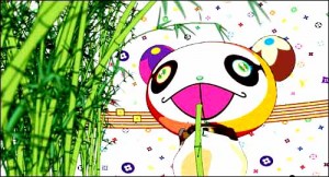 Image from Superflat Monogram
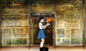 Image from Superflat First Love
‘Superflat First Love’ is not the first animation production between Takashi Murakami and LV. Before ‘Superflat First Love’, they have already produced an animation ‘Superflat Monogram’.
In 2003, Takashi Murakami collaborated with Marc Jascob to create a new colorful LV Logo, this created huge impact. With this design, Takashi Murakami produced the ‘Superflat Monogram’ animation. After that, he created a series of designs, called ‘Multicolore Spring Palette’ for LV, and also produced an animation for this, which is ‘Superflat First Love’.
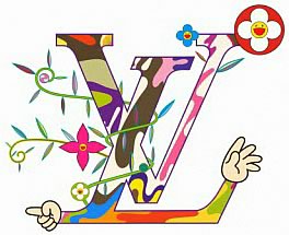 LV logo designed by Takashi Murakami
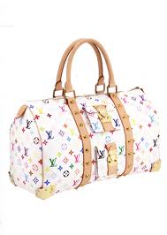 LV logo & product designed by Takashi Murakami
Both the Superflat animations are produced and directed by Hosoda Mamoru. Hosoda Mamoruis a famous Japanese animator and director. He directed many famous animated movies, including: ‘Digimon: The Movie (1999)’, ‘Wolf Children (2012)’; Some of them are even awarded movies, including: ‘The Girl Who Leapt Through Time (2006)’ and ‘Summer Wars (2009)’. He is famous from his unique technique to represent the virtual world: the inner view of a white sphere, where the interior wall of the sphere displays different patterns and symbols. We can see this technique in each of his films with the theme of virtual world, including both Superflat animations.
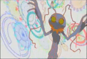 Image from Digimon: The Movie
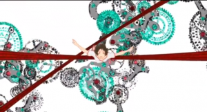 Image from The Girl Who Leapt Through Time
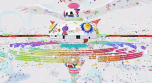 Image from Summer Wars
The original sound track in the Superflat Monogram animation, is called ‘Different Colours’ performed by ‘Fantastic Plastic Machine’, who is a Japanese DJ called, Tomoyuki Tanaka. In this sound track, he combines different type of music style and creates a beautiful music to describe the colourful Louis Vuitton world that Takashi Murakami creates.
Takashi Murakami is famous throughout the world; the most well-known reason is his design of many series product for the France brand, Louis Vuitton. In Japan, he is the most influential artist nowadays, he is being called ‘Andy Warhol of Japan’; and he is idol of many young art lovers in Japan.
Superflat is an Art movement which is found by Takashi Murakami, which is influence by anime and manga, by the concept to transport art to Western countries. It is also an irony to describe Japan as their society is flat without different dimensions; it shadows the emptiness of Japanese consumer culture. A group of artists include Takashi Murakami held an exhibition of Superflat at America in 2007, to express that Japan’s pop-culture and art are highly linked together. People cannot find a definition to divide pop-culture and art, just like the feeling that Andy Warhol gives them.
The reason that LV choose Takashi Murakami, is that they want to bring the concept of Superflat art movement into their luxury products. You cannot imagine how the colorful flowers and panda of Takashi Murakami bring changes to this traditional brand. Firstly, the cross over between pop-culture and traditional brand creates topic for people to discuss, this also create opportunity for advertising. Secondly, as Takashi Murakami is good at using logo and signs in his art work, when he apply his style in LV products, people need to think and explain meanings behind the symbols. Lastly, when pop-culture and traditional combines, this creates business opportunity and open new market to target new and young customers. There are clearly data shows that the sales of LV had sharply increased after the release of Takashi Murakami’s design.
Symbol is the most important key in the consuming system. When we buy a luxury goods, what we buy is actually the symbol. For example, without the LV logo, their products are just worthless brown-yellow bags. What LV and Takashi Murakami wants to express is, they want to create a product is a symbol, where the product worth the value of the symbol itself. So that when customers buy their products, they are not buying the symbol, but the product.